2/22/2023
Dear Trader,
Sounds like a wonderful vacation spot.

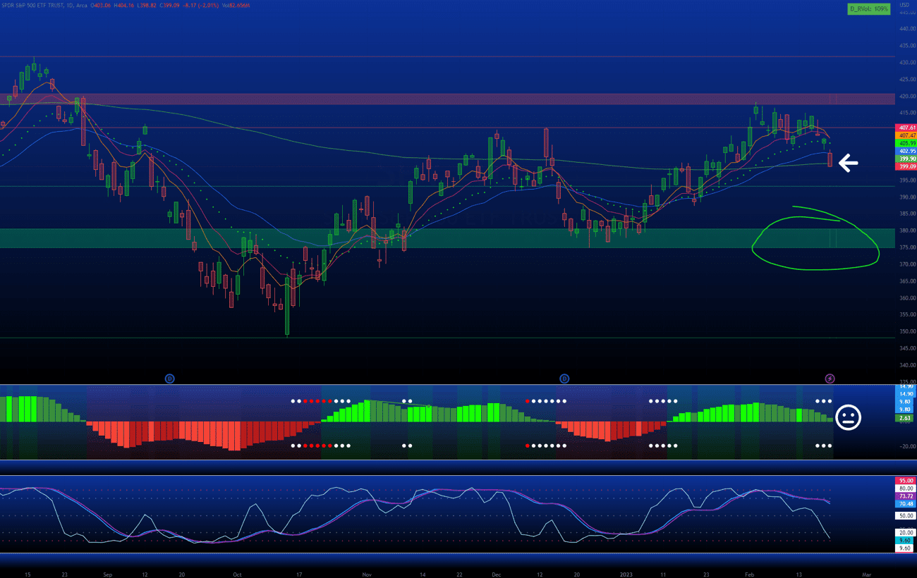
Something I mentioned recently to my inner circle was that the index was essentially just hanging out there and floating…
In other words, the SPY was vulnerable after failing to move past the red horizontal channel of Resistance between ~$417.00-$421.00.
Yesterday, it closed with almost no upside strength and fell below the 200ema (white arrow).
Not a positive sign. In fact, it’s a bad one as the closing price is below all major EMAs…
Checking with the TTM Squeeze on the lower chart, the histogram is dark green and fading fast.
I wouldn’t anticipate a jump to the upside any time soon with this kind of momentum loss, but never say never.
The Stochastic you see at the bottom is a Triple Stochastic that I’ve modified to my personal specs and is a primary driver of my DRAGNET system.
There are two on the chart with the slower combination (28, 2, 5) showing the difference between the K and D lines and then the second not showing it at all, but on a faster setting (14, 1, 2).
The reason I do it this way is because I get an early signal when the white line crosses the
slower combination, allowing me to scale into a position without getting hammered if I’m wrong.
Right now, the reading is bearish, but it’s not smooth… The faster Triple Stochastic with the white line may already be exhibiting signs of oversold, although only in the near term.
It’s the slower setup that’s worth watching for extended swings and it appears there’s plenty of room to fall with the bearish crossover of the blue line now below the purple…
If there’s to be any Support, you can find it in the previous holding range along the green horizontal channel between $375.00-$380.00.
Looks like a short to me…

This material is not an offering, recommendation, or a solicitation of an offer to buy or sell the securities mentioned or discussed, and is to be used for informational purposes only. Any performance results discussed herein represent past performance, not a guarantee of future performance, and are not indicative of any specific investment. Due to the timing of information presented, investment performance may be adjusted after the publication of this report. There can be no assurance that the future performance of any specific investment, investment strategy, or product made reference to directly or indirectly in this communication will be profitable, equal any corresponding indicated historical performance levels or be suitable for your portfolio.